
Formly - Beginner Friendly Gym App
RESEARCH
UX DESIGN
Phase 01: Research Hypothesis
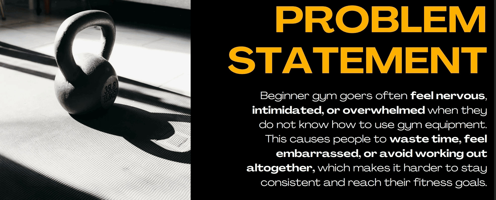
I believe that a lot of beginner gym-goers feel unsure or intimidated when they don’t know how to use the machines at their gym, especially if it’s their first time or a new location. If there was an app that showed the exact equipment at their gym, explained how to use it safely, and helped them plan workouts based on their goals and what’s actually available, then they’d feel more confident, waste less time, and be more likely to keep showing up.
Phase 02: Research + Audience
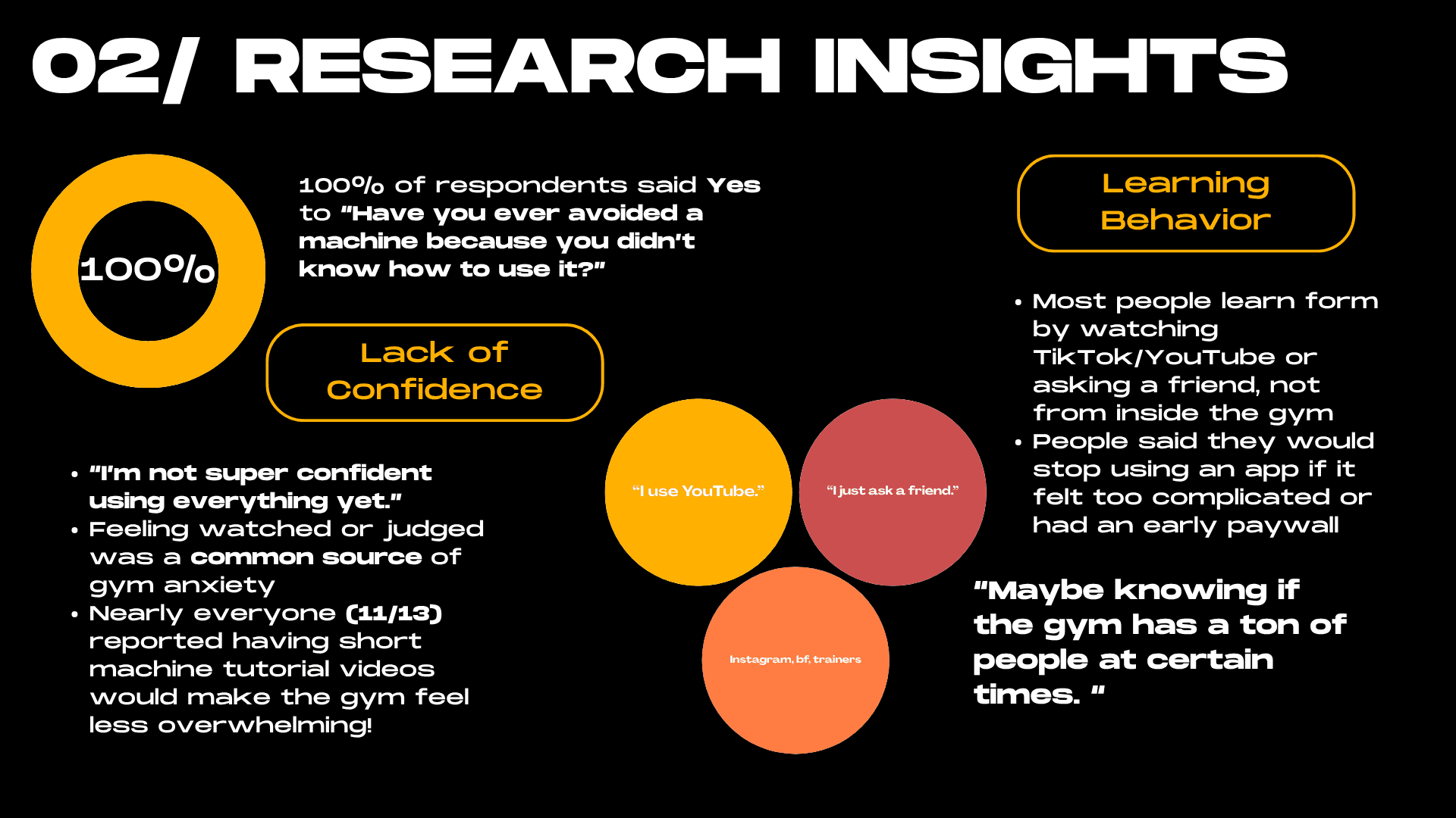
Before touching any design, I created a survey to see if what I was observing was actually backed by data. I surveyed 13 participants in the Gen Z and early 20s range, across different experience levels at the gym. The most striking finding was that 100% of respondents said they had avoided a machine before because they didn't know how to use it. Not most people. Everyone! On top of that, 85% said they turn to TikTok, YouTube, or a friend to learn form, meaning nobody is getting that guidance from inside the gym itself. That confirmed that the gap I wanted to fill was real, and that confidence, not motivation, was the actual barrier keeping beginners from being consistent.
Phase 03: Design Process
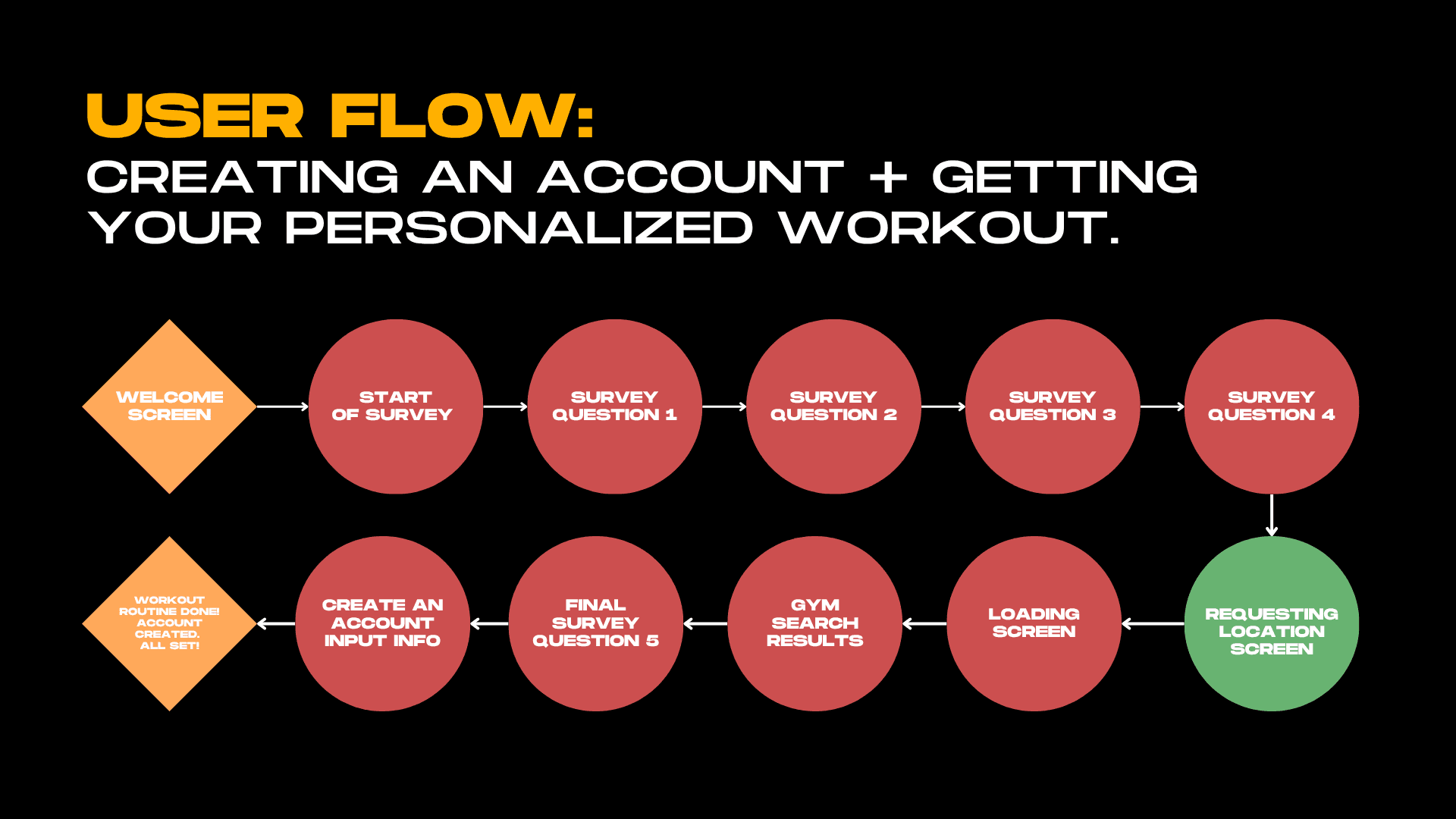
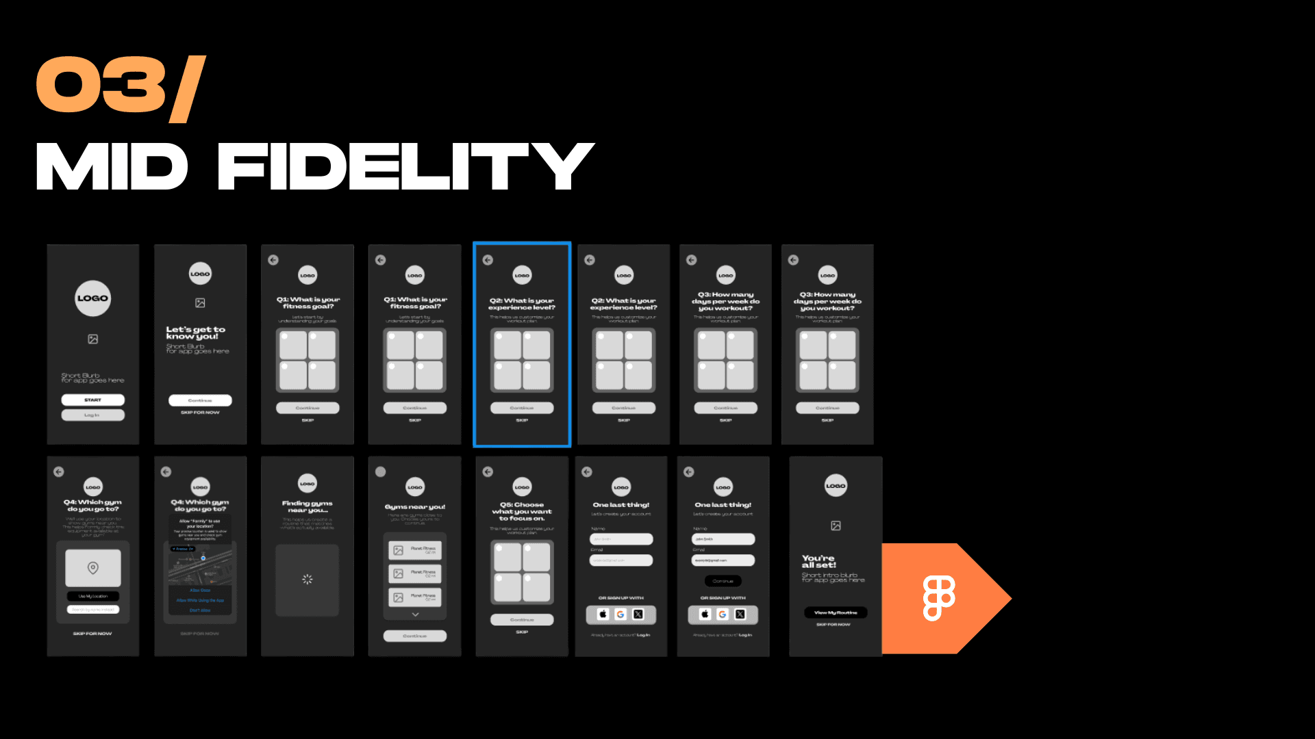
I started with low-fidelity sketches to map out the onboarding flow without overthinking the visuals yet. The onboarding was the most important thing to get right because that's where a beginner decides whether the app feels approachable or overwhelming. From there I moved into mid-fidelity wireframes in Figma, working through 15+ screens covering the intake survey, gym search, and account creation. For the brand direction I went bold and motivational, black and green, heavy typography, and a tone that felt like you had your own personal motivational trainer who would guide you along the way but still be encouraging. With the branding tagline, I landed on was "Confidence starts here," which pretty much summed up everything the app was trying to do.
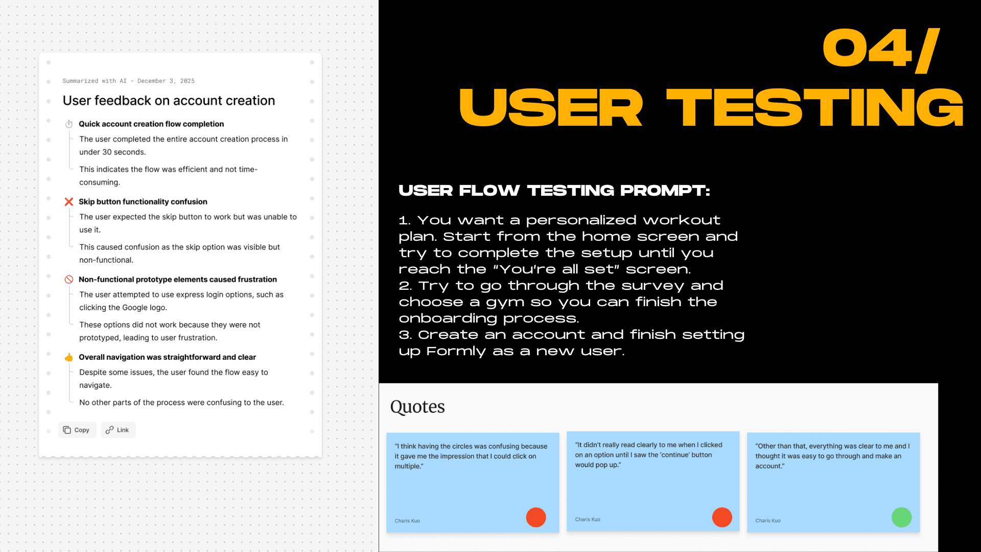
Phase 04: User Testing
Once the mid-fidelity prototype was ready I ran user testing to see where people got tripped up. One tester completed the full onboarding in under 30 seconds, which was a good sign the flow wasn't too heavy. But I also got really useful critical feedback, like that the circular selection UI made it look like you could pick multiple options when you couldn't, and that the skip button was visible but not actually functional, which caused confusion. Those were small things that made a big difference once fixed. 11 out of 13 survey respondents also said short machine tutorial videos would make the gym feel less overwhelming, which directly validated one of the core features I wanted to build into Formly long term.
Phase 05: Reflection
This project taught me that designing for someone who's already anxious means every small decision carries more weight than usual. Whether a button looks tappable, how many steps are in the onboarding, whether the language feels welcoming or clinical, all of it matters more when your user is already second-guessing themselves. If I had more time I'd add gym-specific machine tutorial videos, design out what an actual workout session looks like inside the app, and keep tightening the micro-interactions. But the core insight held up: when people feel prepared before they walk in, they're way more likely to keep showing up.
Phase 06: Final High Fidelity Prototype Demo — Onboarding Process
Check out the prototype here