
KeyKit
UX DESIGN
RESEARCH
Phase 01: The Problem Worth Solving
Food waste is something a lot of people my age deal with, especially when you're living with roommates and trying to cook on a budget. The problem isn't that people don't care, it's that keeping track of what's in your fridge, what's expiring, and what to actually make with it all is harder than it should be. KeyKit is a mobile app I designed to help users track their food inventory, discover recipes based on what they already have, and stay within their grocery budget.
Phase 02: Research + Audience
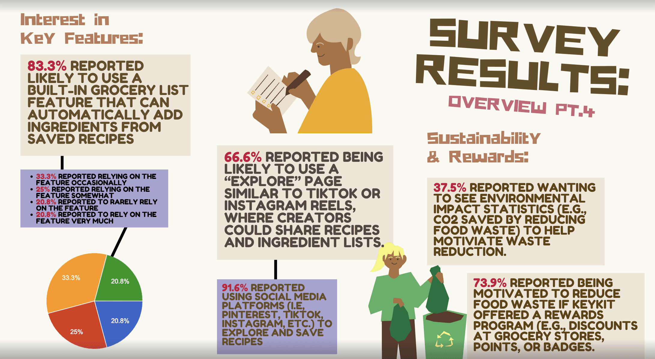
I ran a 20-question survey and collected 24 responses, with 91.7% of respondents in the 18-24 range and 62.5% living with roommates. 50% said they deal with leftover ingredients they don't know how to use monthly, and 87.5% weren't using any food management app at all. The biggest motivators were saving money and a potential rewards system, which directly shaped the features I prioritized building.
Phase 03: Design Process
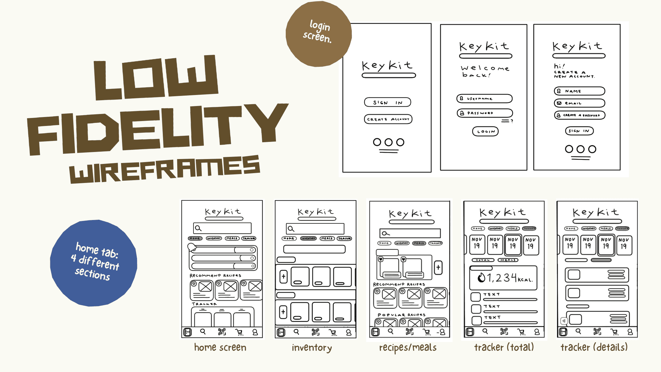
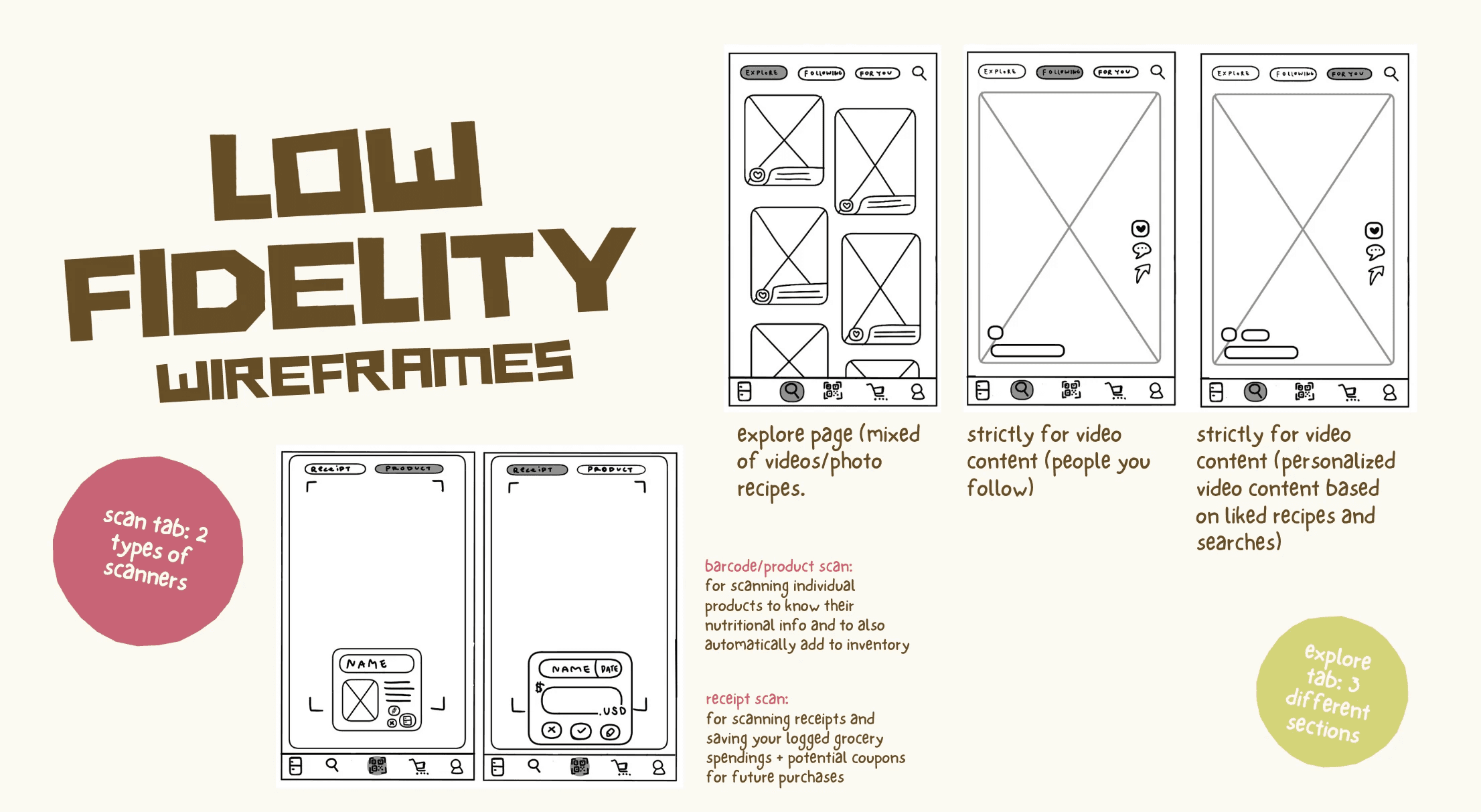
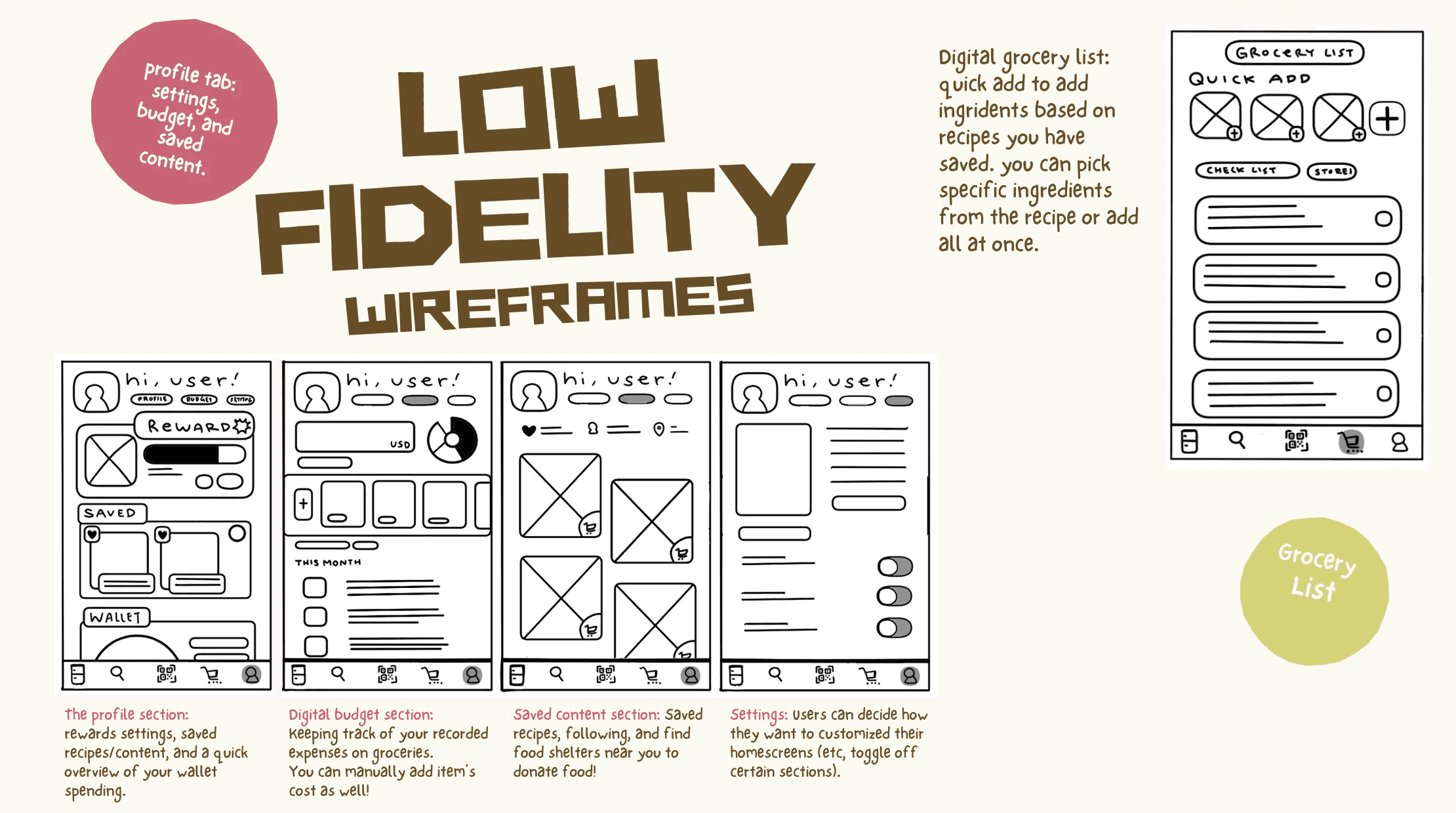
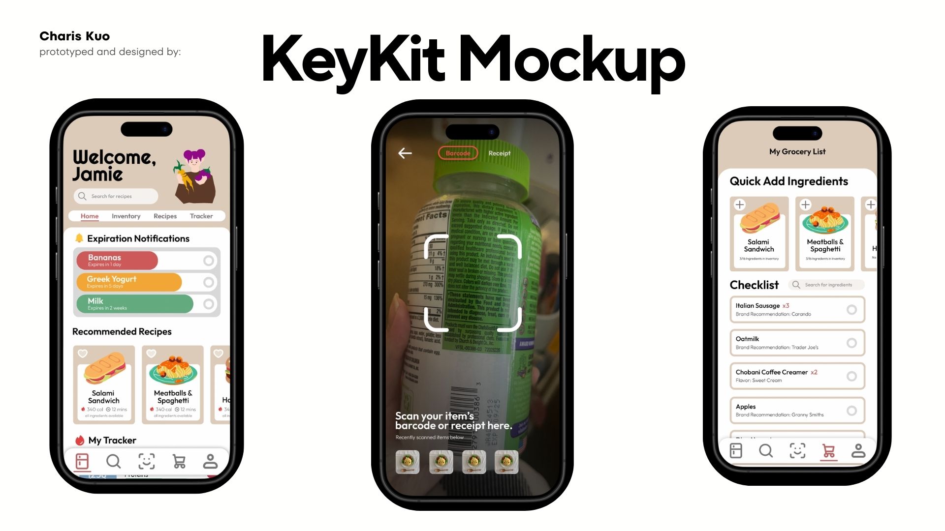
I started with low-fidelity sketches to map out five core tabs: home, inventory, scan, explore, and profile. The scan tab had two functions, a barcode scanner and a receipt scanner, both pulled straight from what survey respondents said they actually needed. From there I moved into high-fidelity screens and a full information architecture map to make sure the navigation held together across the whole app.
Phase 04: User Testing
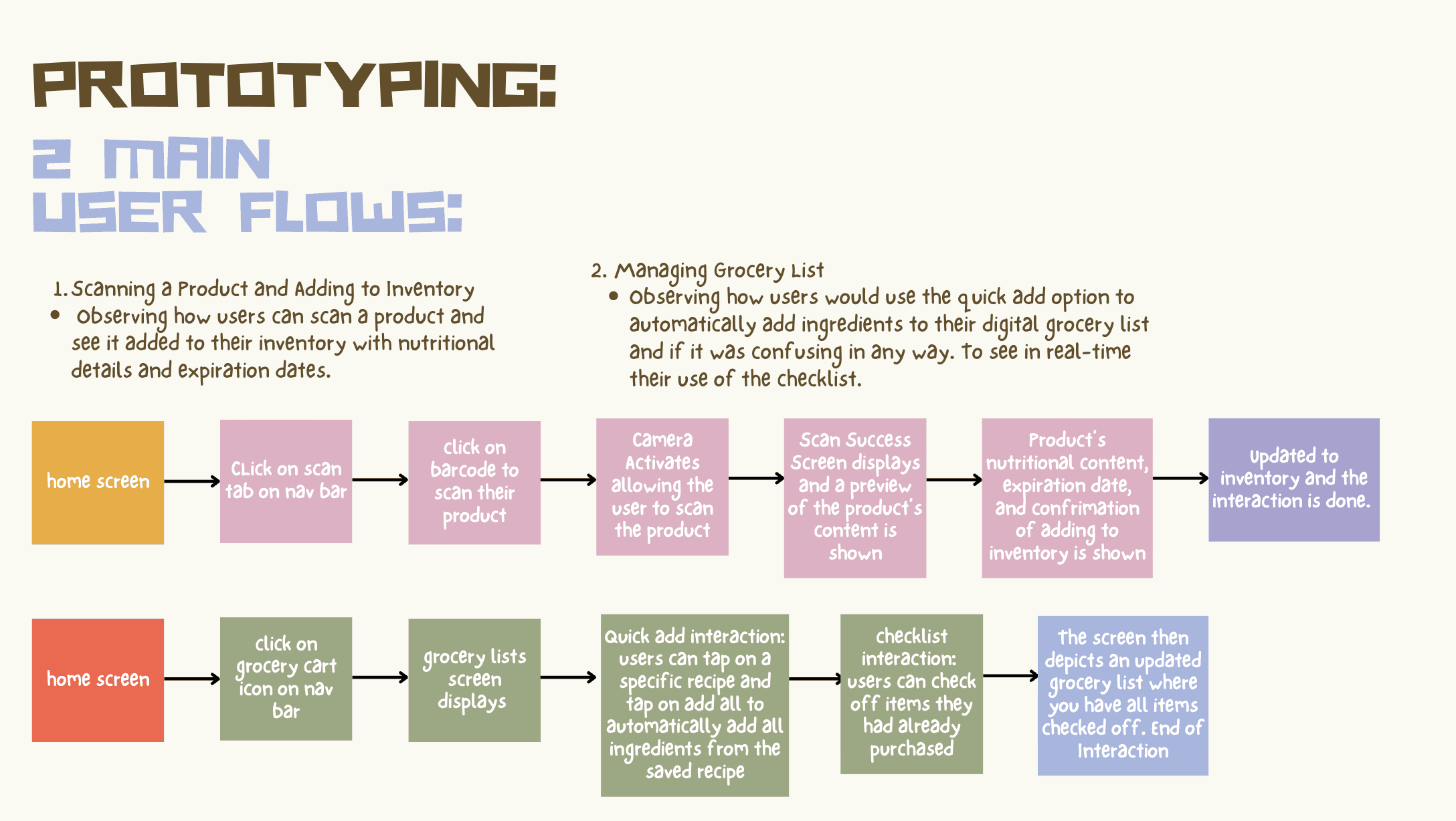
I tested two flows: scanning a product into inventory and using quick add to build a grocery list from saved recipes. The positives were clear, users loved the scanner, the grocery checklist, and the overall visual design. The critical feedback was just as useful though, one user got disoriented by a stuck nav bar, another needed a clearer way back to inventory after scanning, and a third wanted more personalized recipe filters. All things I wouldn't have caught just reviewing my own screens.
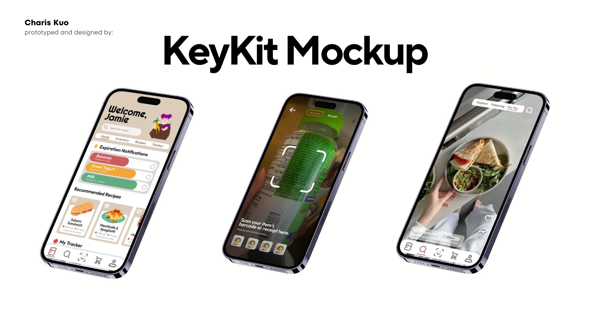
Phase 05: Final Prototype + Reflection
Check out the prototype here
This project taught me what it actually means to design a system rather than just individual screens, where decisions in one tab affect how another tab makes sense. If I had more time I'd smooth out the prototype interactions, fix the navigation gaps, and build out the rewards and gamification features more since the data showed that's what would actually keep people coming back.