
Settl
RESEARCH
Phase 01: The Problem Worth Solving
Moving to a new city is exciting, but it can also feel really overwhelming. Whether it is for school, work, or a fresh start, people are suddenly expected to figure out unfamiliar systems and resources on their own. Through my research, I found that most people rely on random online searches or word of mouth to figure things out. Settl was designed to make that process easier by giving users personalized guidance and clear next steps.
Phase 02: Research + Audience
I interviewed 3 students who had all experienced relocating to a new city on their own. I also conducted card sorting activities to better understand which parts of relocating felt the most stressful.
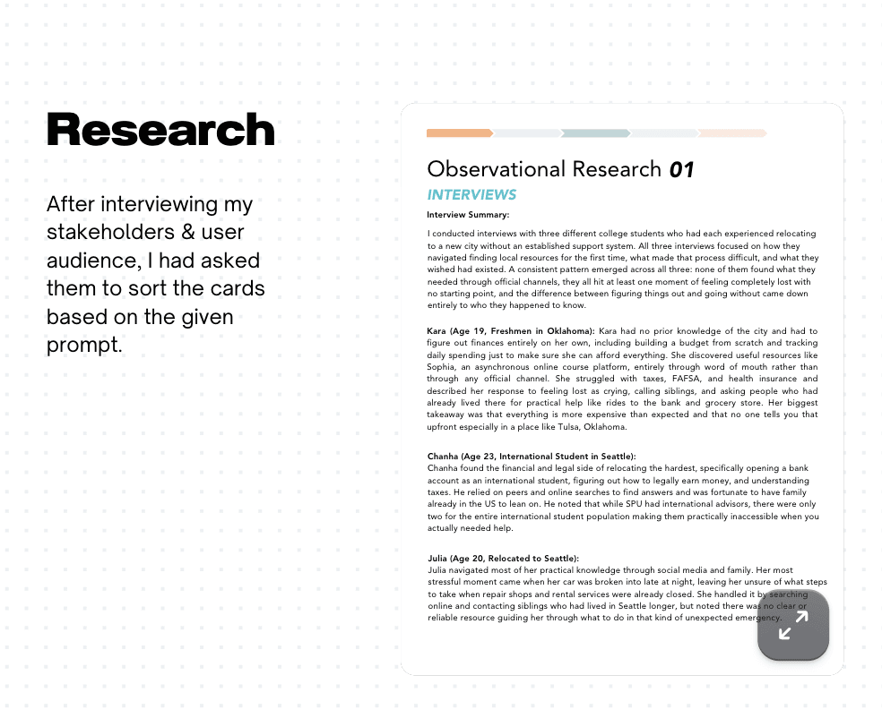
A common pattern showed up across all participants. None of them found what they needed through official channels. Instead, they relied on friends, family, or searching online for answers.
Phase 03: Key Research Insights
One of the biggest findings was that financial navigation was the most stressful part of relocating.
100% of participants ranked banking setup and understanding what they qualified for as one of their top concerns.
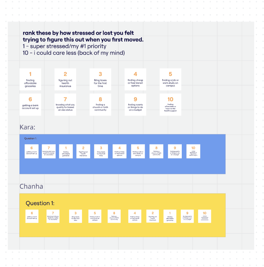
Other major stress points included health insurance, taxes, and transportation. These insights helped shape Settl’s focus on practical and personalized support.
Phase 04: Journey Mapping + Problem Definition
I created a journey map to better understand the relocation process through 5 key stages:
Arrival, Getting Set Up, Finding Resources, Taking Action, and Settling In.
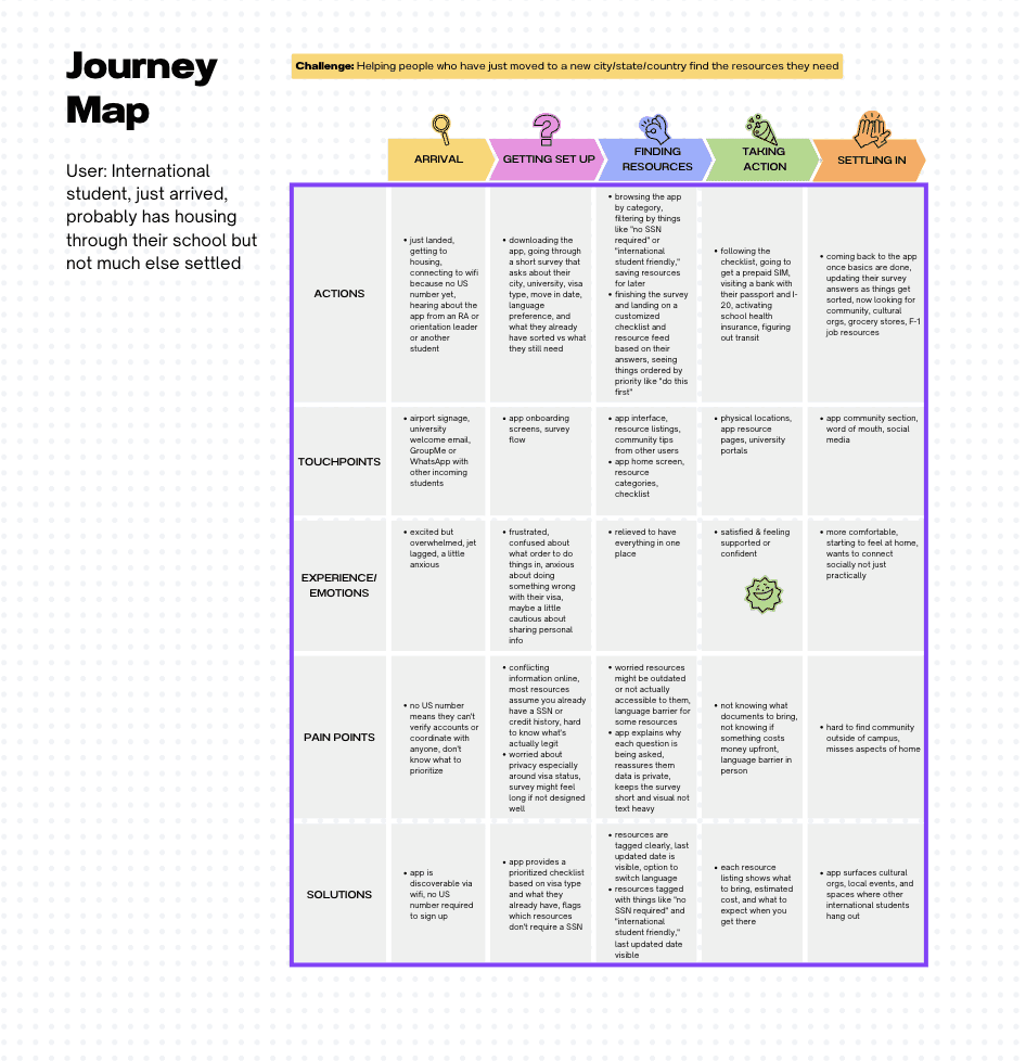
This helped reveal where users felt the most lost and overwhelmed.
This led to my main design question:
How might we help newcomers quickly find personalized resources without having to depend on who they know?
Phase 05: Design Process
I started by sketching different user flows and exploring ways users could input their relocation needs.
The main goal was to create a simple onboarding experience that could gather important details and turn them into personalized recommendations.
Through several iterations, I simplified the navigation and focused on making the experience feel clear and approachable.
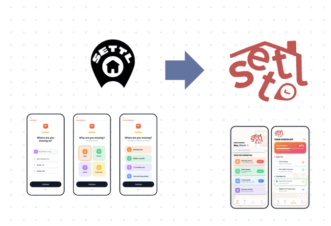
Phase 06: Design Iteration
As I developed the high fidelity prototype, I received feedback that the original logo felt disconnected from the rest of the app.
I was also encouraged to make the design feel less corporate and more warm and approachable.
Using this feedback, I refined the logo and softened parts of the interface to better match Settl’s supportive and welcoming purpose.
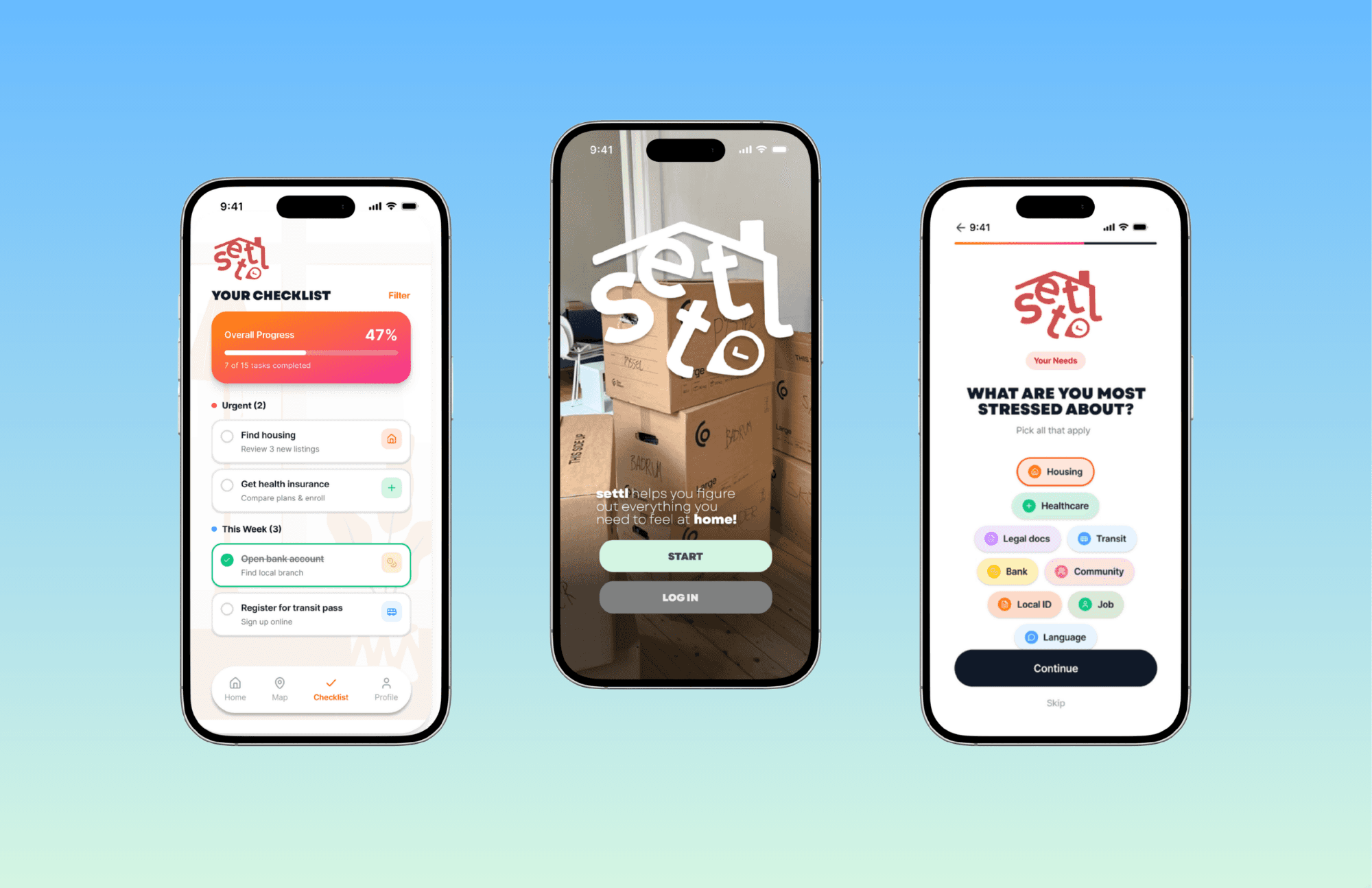
Phase 07: Final High Fidelity Prototype + Reflection
The final high fidelity prototype brings together Settl’s goal of making moving to a new place feel less stressful and overwhelming.
After critique, I updated the logo and made changes to the overall design so it felt less corporate and more warm and welcoming. These updates helped make everything feel more connected and better matched Settl’s purpose of supporting users through a big life transition.
Through personalized onboarding, practical resources, and progress tracking, the final design helps guide users through each stage of settling into a new place.
This project helped me grow my skills in research, journey mapping, and high fidelity prototyping, while also showing me how thoughtful design can help people feel more supported during change.
Here is the link to my Figma Prototype!